
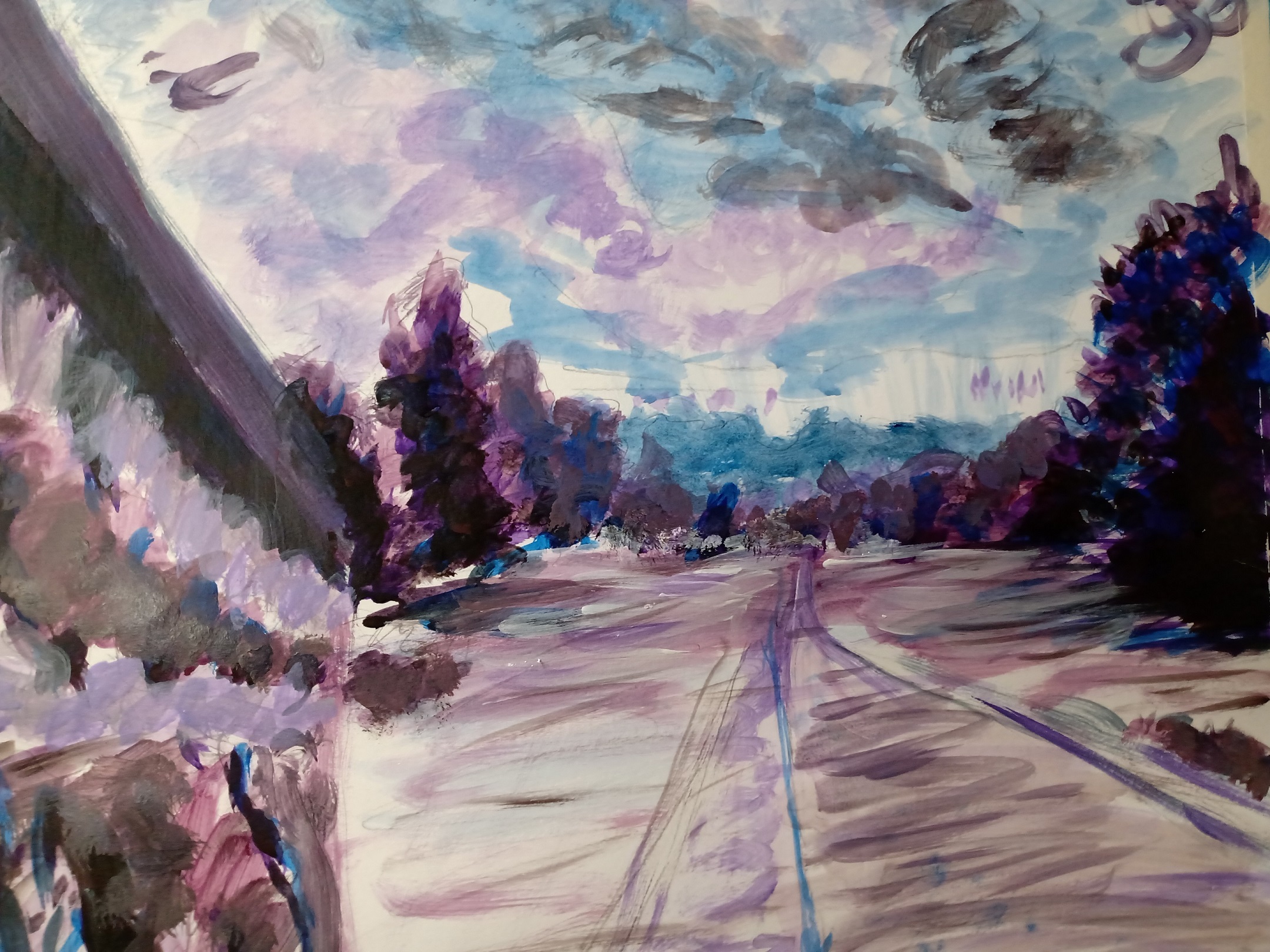
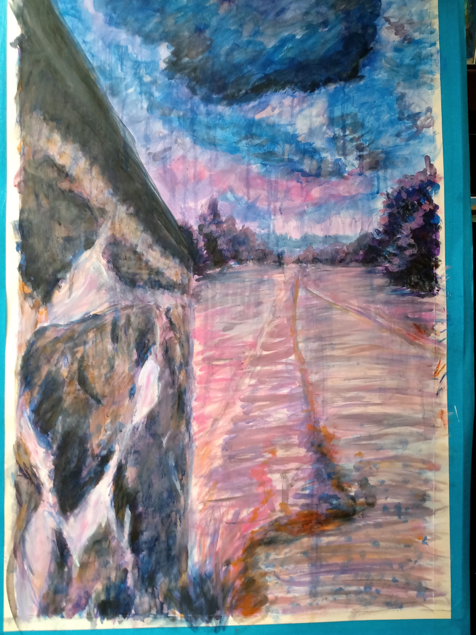
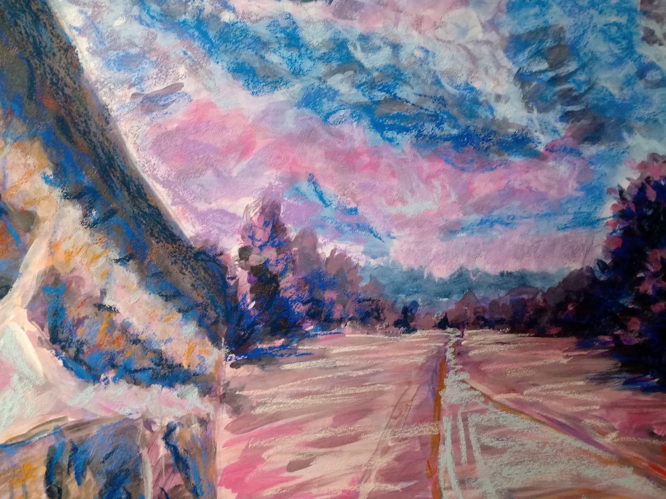
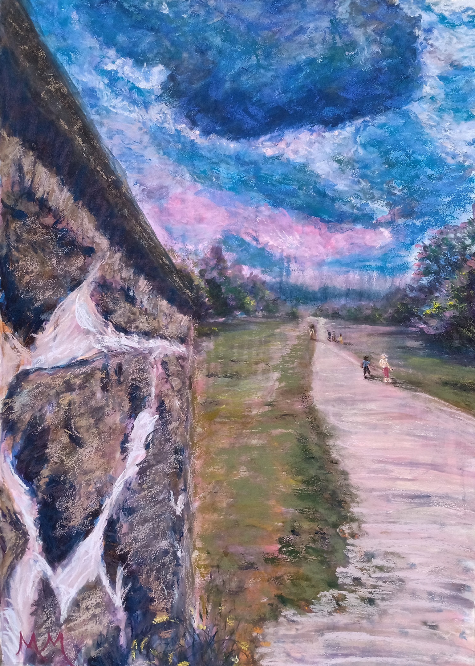
Here’ some progress slider shots of my recently finished painting “Clouds at Stroud II”. I always start with a sketch, laying out where most things will lie and a general outline. I then move on with Acrylic Paints and start to determine where the lights and the darks will be. As seen here with this example, I tend to use Purples and Blues as my main choice. I will also select complimentary (or opposite) colors to add that punch for the end result. This can be seen with what will be grasses and is mostly orange and pinks and purples in the beginning stages. All green gest too boring in painting, even though that’s what we mostly see with our eyes in a scene like this. The rocks were very important in setting the values (lights and darks) early on. They took layer upon layer to get just so. Finally it came time for the pastels. I laid down a few similar colors to the acrylic paints and washed them in with water almost like watercolor paints. This created a really dreary rainy effect which was perfect. I was almost tempted to leave it there, but knew how great it would be if I kept fine tuning things after the wash. Hope y’all enjoyed a little insight into how I do things. Keep posted for more to come. This is just the first of many. The original is available at www.matthewmacheskifineart.com/product/clouds-at-stroud-ii Don’t forget to subscribe to my email list at the bottom of the homepage> Check spam. It gets dumped there sometimes if it doesn’t show. Have a wonderful week all!


